Better Architecture Diagrams for Agile Teams: actionable tips and lessons.
Software engineers, testers or product managers use mental models to reason about the systems they work with.
These different roles use architecture diagrams to build their own mental models.
People will make assumptions based on their understanding. And how you craft these diagrams will have a tremendous impact on the correctness of the assumptions.
Architecture diagrams are like text documents. It’s easy to create one. But it’s hard to create a good one. I would argue that for technical documentation, diagrams are even more difficult.
Drawing boxes and arrows is easy.
Sketching out the boxes and arrows is the easy part to put down on paper. The arrangement of these notations and the contents they represent is much harder to convey to the reader.
How do you make sure the reader will understand it as you do?

Microservices, by Krazam. (src)
To answer that question, we need to ask ourselves why we create architecture diagrams. This will drive us to list the various goals we want to achieve with these diagrams. We will identify the main constraints to keep in mind to reach these goals, true for any diagram and any audience.
Once you know the goals and constraints, it will be easier to remember the few common guiding principles we will present to help you achieve these goals.
Why are you creating an architecture diagram?
The most common use case, and the only one we cover here, is diagrams used to transfer knowledge between humans.
We could use them for many different purposes: document the component interactions, the data flow, how things are deployed, how things talk together, or where some planned changes will occur within an existing system. The diagram might be part of a collection. It might be created to help with decision making, or it’s used to finalize design decisions before turning it over to developers, or it’s a shared artifact between the development team to help with the documentation.
Ultimately, it’s only about transferring information to someone else in a compact way. The compact aspect is important: if the reader needs a lot of text to understand the diagram, or if you need to explain the diagram personally, these are strong signals that the diagram needs improvement.
Red flag: if the reader needs significant explanations, written or spoken, to understand the diagram, you need to improve or simplify it.
Building a shared mental model
You — and any other individual — build a mental model to reason about a system. It’s our raw material to think about something abstract.
As the complexity of a system increases, the accuracy of any agent’s model of that system decreases.
— Dr. David Woods
No matter how much effort you put in your documentation and diagrams, other people will build a mental model of the system which will be different from yours. Actually, your own mental model of the system is probably different from the one you had a few weeks or months ago. And it will be different in the future.
That’s fine.
A mental model is a model: it’s imperfect by definition, but it’s a helpful tool to reason about the system.
Remember that your platform is a magical black box to your users. You can’t expect them to behave reasonably without feedback loops and a rich mental model. Help them out — esp your super-users. It will save you time if you can help them help themselves.
— Charity Majors 4th platform commandment. (src: Ten Platform Commandments)
Your goal is not to help people build a model which will be as close as possible to yours.
Your mission is to help them build a good mental model.
Here, we find two different ways to qualify what “good” means in this context.
One could help them build a mental model that allows them to get their job done, with a reliable too to think correctly about the system.
Another is to build some common ground between you and them.
Common ground: pertinent mutual knowledge, mutual beliefs, and mutual assumptions that support interdependent actions in some joint activity.
— Herbert Clark
These two objectives usually overlap, but sometimes you only target one of them, for instance, building a high-level diagram to let people understand the system. Still, they might never directly have to interact with it. This is very different than when you create a diagram to help operators troubleshoot the system.
People build their mental models based on the collection of information they would gather from your diagram in combination with their existing knowledge of the system. They collect these other pieces of knowledge through documentation and through their interactions with it over time.
In the end, each person will build their own model.
People work with different parts of the systems, and at different levels. So that’s perfectly fine, as long as it’s not wrong. It’s not perfect nor accurate, but it needs to not be wrong.
Richard Cook explained it beautifully in his “Working at the Center of the Cyclone” talk, slowly building the diagram below to illustrate how different roles build their own mental model, different from those created by other people, from their interactions with the system. Nobody knows exactly the internal state of the system. We all infer it from what we observe and learn from the system. The key thing here is that these models don’t need to be complete. They need to be correct and accurate enough for the task.
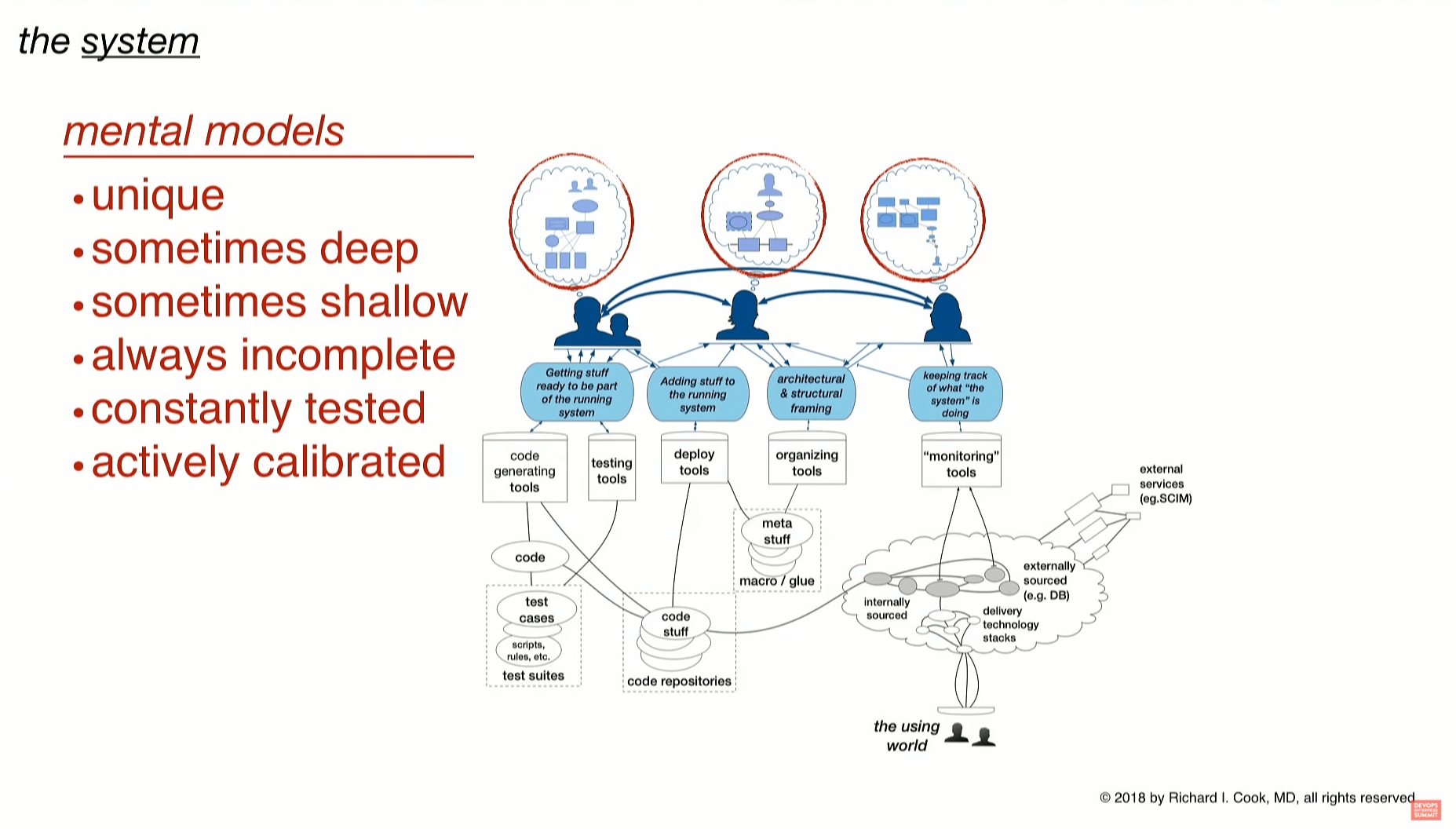
Mental models are unique. always incomplete, constantly tested and actively calibrated, from Dr. Richard Cook’s “Working at the Center of the Cyclone” talk. (src)
This implies that if these needs are so different, you may need different diagrams.
And although it sounds like it’s more work (and yes, it is), it’s actually helpful because it helps a lot in defining the scopes.
Multiple audiences, multiple purposes: know your audience.
This one is obvious but often overlooked. If the audience is the technical team already knowing a lot about the existing system, you can assume a lot. On the opposite side of the spectrum, people external to the project — or even to the domain — have much less prior knowledge.
One key idea is that diagrams you put in your internal documentation, onboarding documentation, or presenting your project to external partners/clients should be very different. If you find yourself re-using one diagram for a different audience, stop and think for a second if they have all the prior knowledge to understand this diagram. Sometimes it’s close enough to do the job. Sometimes there is a chasm between the two intended audiences, and you should either build a new one, or just skip it.
Key idea: Be explicit about the target audience. Think about their prior knowledge about the system and the domain. If you’re not sure something can be taken for granted, you need to document it.
Be explicit about the diagram’s goal
Even if you target a single profile, chances are this person has different goals about the system. And this becomes even more likely if you create this for multiple profiles.
Your main goal could be to share knowledge about the components’ dependencies. Or to share knowledge about the data flows and interactions between components. Or you may want to highlight the changes you need to make to fix some issues, which implies removing some stuff, and new stuff and change other parts.
The list goes on, but you got the idea. There’s one main intent. Well, there should be only one main intent. It could be on the application components, the integration flow, how it’s deployed, which components it interacts with …
If the diagram you’re working on is trying to communicate several goals at once, it’s an indicator you should probably split it into multiple diagrams.
Key idea: Define a single goal. If you want to document multiple goals, create multiple diagrams.
This goal will define the focus. You need to focus somewhere to help the reader understand where they should direct their attention and invest their brain cycles.
You could set the focus on a single component, or on a subset of components that share a common property you want to highlight, or on a flow.
Your focus could be to share the details of a specific flow composed of many steps and involving several components. You usually find yourself creating this when you annotate with step 1, step 2, … Sometimes, a “box and arrows” diagram makes something easier to grasp than with a traditional sequence diagram (or supportive of it). This is your focus.
Setting the focus on shared properties is great when creating a diagram to document some migration or update. Now your focus is on the evolving parts: which ones you will remove, which ones you will add, which ones you will have to change (and all the other ones are left unchanged).
Why is it important to understand and be clear about your focus? Because it then enables you to filter out anything that doesn’t support it. It’s the key filter you can use to remove clutter.
For any stuff in the diagram, you can — and should — ask yourself: if I remove this, does it change how people will understand the idea under focus? If the answer is no, remove it!
Remove things. Simplifying a diagram directly reduces the cognitive load of the reader. It has a direct impact on how much easier the diagram will be to understand.
Key idea: Set the focus on the main things which support your goal, and remove anything that doesn’t support this focus.
In the C4 world, this usually goes as follows: you start your diagram by drawing the pieces on which you set the focus. Then you need to document their connections or relationships, so that leads to their direct “neighbours.” And usually, you should stop adding stuff here. You refine the existing stuff, reviewing/adding the annotations, the legend, but if you build it this way, you’re more likely to not add clutter to your diagram.
The lifetime of your diagram is another critical part of the focus. You should make it explicit to the reader. Write it down.
The reader should know when in time the diagram they look at is accurate. We all know documentation drifts from reality. Are you documenting what it will look like, what it used to look like or what it’s like now?
If you’re only describing a transient state, for example, an update relative to some system evolution or migration, make it very obvious to the reader.
Key idea: Document the validity time frame of your diagram. When it is accurate, and until when it is supposed to still be accurate.
The constraint we should keep in mind as we work on a diagram.
I stated a diagram should focus on a single audience and a single goal.
But why is this mandatory? Why couldn’t we create a huge diagram with everything? It all comes down to the reader’s cognitive load. And that’s also why the audience’s prior knowledge is so important.
This post will not go in-depth about the cognitive load, but let’s review the main ideas we need.
Our working memory capacity is very limited. We can keep roughly just seven items in our working memory at a given time. Seven plus or minus two is the common range we see in the literature.
This is why you want to limit the amount of information to process to the most relevant ones, to make the most relevant thing easy to transfer.
Seven items in our working memory… but what is such an item?
That’s where the concept of chunk becomes helpful.
When you see 4 perpendicular lines, you don’t follow them carefully, you instantaneously see a rectangle. The same goes for the letters’ shape as you read this: you don’t have to analyze the letters’ shapes to recognize them. And the same goes for the words. If a letter is missing, your brain will automatically understand it and correct it. You realize how this chunking mechanism is efficient when you read a foreign language you’re not familiar with. Even more so when you read a foreign alphabet you’re not familiar with (for instance, Japanese or Chinese if you never learnt it).
This is interesting, but it’s also useful knowledge we can leverage to make our diagrams easier to read. The lesson here is to re-use common idioms and patterns the reader will be familiar with. Chunk they already learnt. This means reading and understanding the diagram will be much easier.
If your domain has a common set of shapes and icons, use them! You might believe they have flaws, they are not perfect, and it might indeed be the case. But if the reader understands your diagram much more easily because he already knows the meaning of these shapes and icons, that makes a significant difference! Not only your diagram becomes easier to understand, but because it puts less pressure on the reader’s cognitive load, it’s also less prone to errors.
Great examples of shared standards are data flow diagrams or flowcharts. They already have widespread idioms, like a diamond for question/choice in a flowchart. For data-flow diagrams, Yourdon and Coad, or Gane and Sarson, are the two standards you should consider. If your team/company already uses one, use it! If not, choose one. Don’t reinvent the wheel, and help your reader already familiar with these notations immediately understand your diagram.
Many people experienced how breaking things increases the cognitive load during the big AWS icon revamp from 2019.
Amazon Web Services did a complete overhaul of their AWS Architecture Icons. And it took months for people to switch to using them. We still see the old one used in new diagrams today. We were used to these old icons so much that the cognitive load required to understand a diagram with the new ones was significantly higher in the beginning. We had to re-learn the idioms and re-train our brains to memorize these chunks. In the meantime, we had to carefully read the small details of the icons. Exactly like you need to carefully read the letters of a word in a foreign language.
Key ideas: Minimize the cognitive load, re-use patterns, idioms, icons the audience is already familiar with.
Abstraction levels: you should not insert lower-level stuff…
As you draw your diagram, you will often be tempted to add some lower-level detail. Because this specific stuff is important. Please don’t.
A widespread mistake is to mix abstraction levels inside a diagram. This really increases the cognitive load.
If you need to document something at a lower level — and we usually do — create another diagram.
The C4 model describes this beautifully and is centred around specific abstraction levels. Even if you don’t want to follow this framework, look at it because it clearly describes this.
This is especially true when you want to add a lower-level item into a higher-level diagram.
…but higher-level abstraction additions might be useful for context
The opposite is still useful, though. For instance, if you describe some system with details, and you need to document some useful-but-less-critical interaction with a satellite system, you might choose to either drop this less-critical piece, or to document it with just a higher-level “box” for the satellite system. This way, the dependency or interaction is documented. In this case, it helps to keep the weight on the cognitive load reasonable. It saves the reader many details about that satellite system which is not the diagram’s focus.
Key-idea: don’t mix abstraction levels without reason. Avoid adding a lower-level piece of information into a diagram.
Transferring knowledge is hard, focus on the best effort/value ones
Creating good diagrams takes time and effort. And the systems they document evolve. They usually evolve quickly. You, and your readers, don’t want the diagram to be out of date. Usually, the higher-level the diagram, the slower it changes. Start with these! Especially since they provide useful context to build this common-ground between you and the readers. That will be required for lower-level diagrams anyways.
Key-idea: start with the higher level diagrams. They evolve less quickly and are very useful to build common ground.
A quick review of real examples
Before we wrap up with self-evaluation principles and checklists, let’s review what we covered against a few real examples.
The first example is from Magento’s official documentation: The following diagram illustrates the components and shows the “layers” or tiers in Magento.
Magento’s official architecture diagram of layers or tiers, from Magento DevDocs
On the plus side, they included a legend that describes what each colour means. At least, some of the colours. The reader is left wondering why some of the many arrows are in blue while others are in red. Does this imply anything on the protocol? On the authentication scheme? on the API versions? It’s impossible to tell.
The integrations box on the top left raises more questions than pieces of knowledge. If it doesn’t interact with the rest of the system, how does it work? And why does it need to be in the diagram?
When I read this, I really have so many questions, and it doesn’t help me figure out how Magento is supposed to work.
The next example comes from ConceptDraw examples gallery. I have high expectations for the showcase from a self-proclaimed “world-class business diagramming, idea management and project management platform”.
ConceptDraw’s AWS Architecture Diagrams examples: example 4 - AWS — Mobile Cloud Architecture (src)
There are good things here: we have more labels. They use standard icons (the older AWS icons). But why did they stop halfway? My assumption is that it’s a generic example, so it doesn’t describe a real system, so many details are just unknown.
We see many databases. Do you remember when we said that the connections between the dots are more important than the dots: in this case, it would have helped a lot if they put labels on the connections to explain the purpose of each database, and therefore answer the implicit question “why so many different ones?” The most obvious lack of label is the grouping of 3 instances on the top right.
The take-away here for a reader would be: some stuff moves and is processed before sending stuff to the proxies. Does this help to understand the system?
The goal is not to point fingers. It shows how easy it is to make diagrams, which could be very helpful if the authors took some extra time to review how the intended audience would read them and verify they can use the diagram to understand how the described system works. The people building Magento are smart. If smart people create average-looking diagrams in their documentation, many of us are very likely to not be better. And that’s why I believe in using a checklist, guidelines and some principles to help us.
It’s like a recipe. In the beginning, you rely a lot on it. As you manage to produce good results many times, you internalize it, play with the rules, and check them from time to time only. At some point, you no longer need the guidelines, but they help a lot to reach that point.
Common guiding principles to improve our diagrams.
If we sum up everything, it boils down to two main ideas:
Evaluation rule 1: A diagram should be easy to read
The reader should find answers and new knowledge.
If a reader asks us a question about the diagram (not about the system), it’s a sign: we have room for improvement to make it easier to understand!
Evaluation rule 2: A diagram should be easy to maintain
Things change quickly. We never have enough time/energy to keep it up to date, so we should build it to require as little maintenance effort as possible, as long as the 1st rule is satisfied.
Get it reviewed
Like many documents, you need external feedback to refine your diagrams, find the flaws, identify the parts which aren’t clear. In my experience, we invest little time reviewing the diagrams to improve them. We only create or consume them, most of the time.
Code review or design reviews already taught you the value of this feedback from your peers. We should be as diligent and have our diagrams reviewed before we consider them done.
Guiding principles
- Be explicit about the accuracy in time of the diagram
- Don’t reinvent the language. Use (or build) idioms.
- Avoid ambiguities
- Each connection should have a label.
- Each shape should map to exactly one concept. And each concept should map to exactly one shape.
- The user must be able to immediately understand what each colour means.
- Be mindful of the reader’s cognitive load.
- Don’t try to pack too much in the same diagrams.
- Don’t mix abstraction levels. Higher is ok. Lower is not.
Tools
I stayed away from tooling, because these general principles apply to any tool.
That said, I have my favourite ones. There’s no silver bullet here, and which tool I prefer depends on the type of diagram, its lifecycle (is it a short-lived one for a small knowledgable audience, or is it a long-lived one which will need much more care)
As a rule of thumb, I try to only use a tool for which it’s easy to store the source in git, alongside some rendering if needed.
mermaid is awesome for sequence diagrams, simple flowcharts or state charts or entity-relationship diagrams. Directly supported in VSCode, Gitlab or MkDocs, it’s really something to have in your toolbox.
www.diagrams.net/ (fka draw.io) source is not as friendly (but still let us easily store it in git), but it is a really nice tool as soon as you need to invest more time in the styling, layout, i.e. when the diagram becomes bigger and when you need something more polished.
graphviz is worth being mentioned because it occupies a special place. First, it’s perfect for versioning. Then, I usually use it in the draft stage. The final rendering is usually not very polished (unless you invest a lot of effort), but it helps a lot with experimenting, exploring, and finding some layout. It’s not always useful, but you should not overlook it!
Checklist
This checklist is heavily inspired by the great C4 checklist, with some items removed or merged, and some other new items added.
General
- Is the target reader identified? Is their prior knowledge known?
- Does the diagram have a title?
- Are the goal and focus of the diagram defined? They should be obvious in the title.
- Is the time accuracy of the diagram obvious for the reader? (e.g. date, eta,…)
- Does the diagram have a key/legend?
- Is the abstraction level clear?
- Does the diagram contain any item with a lower abstraction level? If so, are they really required?
- Does the diagram contain any item with a higher abstraction level? If so, are they really only satellite items, and not part of the focus of the diagram?
- Are all acronyms (or abbreviations) obvious to the intended reader?
Boxes and arrows
- Does every element have a name?
- Does every element which requires it have a short annotation to describe what it does?
- Is it easy for the reader to understand what each box represents?
- Are all the arrow directions following the same semantic? (i.e. do you mix x uses y, and x is used by y arrows. Try to be consistent!)
- Does every relationship have a label describing the connection?
Styles
- If such a common language exists, are all the shapes/colours/icons following the common domain language idioms?
- Is it obvious to the reader what each colour represents?
- Does each colour always represent the same idea?
- Is it obvious to the reader what each shape represents?
- Does each shape always represent the same idea?
- Is it obvious to the reader what each line style (solid, dashes, …) represents?
- Is it obvious to the reader what each icon represents?
Wrapping up
All these tips, flags and guidelines should sound like common sense.
Yet, if you look back at the diagrams you have been exposed to, it’s very likely most of them didn’t check all these conditions. And that’s the beauty of this approach.
You could learn a complex set of rules or yet another standard.
Or you could try to use this simple list of easy actionable tips, and start improving your diagrams.
Thanks to Kat Chuang and Wajdi Al-Hawari for their precious feedback on the early copy.